From Fragmented Workflows to End-to-End Sample Tracking
Research & Experience Design to optimize automated sample tracking in the Sample Nexus web application.
Tracking samples with Excel was slowing critical work down
For researchers, relying mainly on Excel for tracking samples felt like a nightmare. It was time-consuming, error-prone and counterproductive.
I was part of a complex and data-heavy project to design the research and the sample tracking experience for one of the largest global pharmaceutical leaders.
To comply with my non-disclosure agreement, I have omitted and obfuscated confidential information in this case study. All information in this case study is my own.
One system to rule them all
Our goal was to capture all sample data into one, unified system — the so-called "one-stop-shop" — providing real-time insight into where the samples are and what's going on with them.
Our ambitions were to create a strong toolkit for a highly demanding regulated environment and a diverse user base.
Make it fast and efficient to manage samples.
Enable researchers to easily make responsible, data-driven decisions.
Reduce operational costs — money and other resources.
Help drug development move faster.
Three groups had different responsibilities,
but the same visibility problem
Sample Nexus had to support people doing very different work across the sample
lifecycle. What connected them was not the same job title, but the same operational
pain: fragmented data, manual tracking,
and limited end-to-end visibility.

Scientists
Identified responsive patient groups for clinical trials.
Key needs
- Analyze biomarker data across studies
- Track study progress in real time
- Understand sample status without juggling multiple systems

Sample Operations Coordinators
Managed collection, delivery, and analysis workflows.
Key needs
- Process large data volumes without errors
- Prepare and manage documentation end-to-end
- Monitor integrity and verify lab receipt

Data Integrity Specialists
Focused on data quality, compliance, and trend analysis.
Key needs
- Reliable tracking and cleaner data pipelines
- Manage compliance queries and audit trails
- Reduce gaps and improve oversight
I led the research and design in a large remote cross-functional team
I was the sole designer on Sample Nexus, responsible for research and experience design for roughly 2.5 years — and earlier, test lead for about a year before stepping down to give design the full attention it needed. I owned the product design from 0 to 1.
The project ran across a large remote team spanning engineering, validation, data, and product. Clear responsibilities and strong async habits made collaboration one of the biggest pillars of the project's success. The app launched internally and was widely adopted across the organisation.
Changing requirements and missing data shaped the project from the start
It's no secret that the more complex the domain is, the more challenges you are about to face when you start to uncover what you're dealing with. This project was no exception. Requirements changed often, some necessary data turned out not to be accessible when features were already being scoped, and new stakeholder details kept reshaping what was possible in each sprint. At the same time, combining research, design, and testing responsibilities created delivery pressure and eventually required a handoff of testing duties.
The constraints that mattered most
Key data was sometimes unavailable after planning had already started
Sprint scope changed as dependencies and new details surfaced
The complex healthcare domain itself introduced many unknowns
My dual Test Lead / Designer allocation created bottleneck risk

Earlier interviews exposed the core operational gaps
To build an initial understanding quickly, I analyzed 20 interview transcripts collected earlier by Business Analysts. This gave me a fast way to extract real user pain points without starting from zero, especially because I was balancing design work with testing responsibilities at the time.
This synthesis also helped define the three core user groups the product needed to support. More about each group — in the Users & Audience section earlier.
I used benchmarking and workflow mapping to turn research into direction
Before moving into strategy, I used two lightweight methods to strengthen the foundation: benchmarking and a walkthrough of the current cross-tool workflow. These helped me bridge the gap between current limitations and future potential.
Benchmarking clarified how data-heavy tools stay usable
I benchmarked other data-heavy products to understand how they handled large tables, dashboards, charts, and dense operational information. I focused on patterns that improved clarity, supported faster scanning, and made complex workflows easier to interpret. This helped me ground the design in proven interaction patterns rather than assumptions.
Prioritize fields that make data easier to find and compare
The best table examples did not treat every column equally. They surfaced the fields most important for search and comparison, reduced the prominence of secondary metadata, and used grouping, expansion, or layering to declutter dense datasets. This made tables easier to scan quickly while preserving access to deeper information when needed.
Keep filtering and actions in context
The strongest products kept search, filtering, sorting, pagination, and bulk actions inside the table context instead of scattering them across the page. This helped users narrow large datasets quickly, reduce unnecessary visual noise, and surface the information they needed faster. As a result, the table felt like an active workspace rather than a static output.
Separate overview from drill-down
The clearest dashboards answered the top-level question first. They used the first screen to show status, trends, and exceptions, while deeper exploration happened through linked reports, filters, or detail views rather than through one overloaded canvas.
Choose chart forms that reduce decoding effort
The best chart examples were easy to read because the visual form matched the task. They used simple chart types for comparison or trend reading, relied on direct labels where possible, and used color to support interpretation rather than carry it on its own.
How it influenced the design
Benchmarking helped me define a clearer direction for the product early on. It showed that the biggest improvements would not come from adding more data to the screen, but from structuring it more intentionally — so users could scan faster, interpret status more confidently, and act on operational signals earlier.
Key design takeaways
Scanability
What matters, first
Operational signals
Surfaces bottlenecks early
Status visibility
Clear without reading
Progressive disclosure
Show more, on demand
Decision-support visuals
Data that drives action
Walking the Existing Workflow Revealed Where It Broke Down
To understand how researchers and operations teams were working before the redesign, I walked through the existing user paths across the internal tools already in use. This helped me see where the workflow was fragmented, where manual effort was concentrated, and where visibility was missing.
Check sample details
Tool AVerify shipment or lab status
Tool BUpdate or confirm data manually
MS ExcelSearch for supporting documents
Tool CFollow up with teams to understand what happened
Direct communicationNo single end-to-end view
Users switched between tools to see where a sample was, what had happened to it, and what came next.
Manual steps slowed the workflow
Information had to be checked, entered, or reconciled manually, slowing work and creating more room for errors.
Issues surfaced too late
Because status, custody, and operational signals were fragmented, delays were harder to spot early and fix.
This showed that the biggest opportunity was not adding more information, but connecting the workflow into one clearer, traceable system.
Together, these methods helped ground the strategy in both established UX patterns and real day-to-day workflows, making it easier to move into design with clearer priorities.
Now, I had a solid foundation for what was coming next.
What an Ideal Sample Tracking Experience Needed to Do
Before jumping into screens, I defined what success needed to look like.
Two questions shaped the strategy:
How can I design for everyone — Scientists, Sample Operations Coordinators, Data Integrity Specialists?
What's the perfect sample tracking experience?
- Fast & seamless
- Everything in one place
- Ensures data safety and integrity
- Regardless of who uses the tool — they get what they're looking for
- It happens automatically
- Enables unmistakable sample identification
- Includes both top-down, holistic views as well as the possibility to drill down into details
- All views are downloadable — easy to insert into external documentation or share with colleagues
- Tables are the primary display format the organization is accustomed to
- Tables must be exportable to MS Excel / Google Sheets
- Works seamlessly alongside Google Suite, AppSheet, ServiceNow and other specialized internal tools
Let's create a one-stop-shop for all sample management operations so that it helps everyone interested
Sounds great! However, the following aspects also had to be taken into account first:
- My allocation as both a Test Lead and a Designer could potentially cause bottlenecks and slow down development.
- With so many aspects of data to consider, there was a real chance of problems — data unavailable, not extracted properly, or not meeting standards.
- A fully customized experience per user group would require role-based access or configurable content (dashboards, tables). Due to time constraints and the Tableau technology stack, this was not possible at the time.
- The overall solution scope was so large that for MVP, only a fraction of the vision could be delivered.
- Our team depended on 11 internal teams: data standards & quality, data transformation, protocol compliance, estimated sample collection schedule, sample registration, and laboratory data coordination.
- External dependencies included laboratories and hospitals providing source data — our work was the final stage in the whole chain.
Translating the Strategy Into Product Design
The design direction was simple: lead users from situation to investigation. Rather than a set of disconnected screens, Sample Nexus became one coherent system — moving from overview to detail, from understanding the state of things to acting on it.
Design reviews happened iteratively with users and stakeholders throughout. Most changes were small — the broader direction stayed anchored in visibility, traceability, and faster operational understanding.
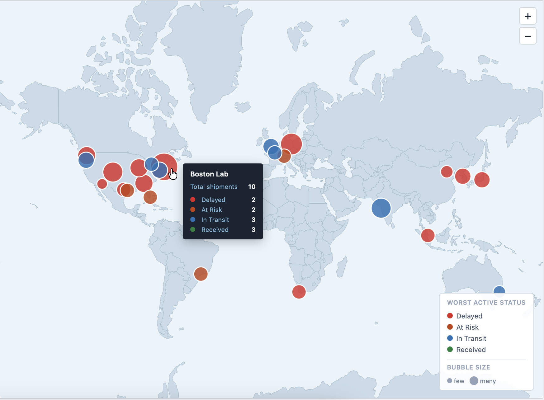
A command center for operational visibility
At a glance, teams could see total sample counts, custody status, and pending shipments — without opening a single report. The overview surfaced what mattered to each team's daily work: what was moving, what was delayed, what needed a decision.
- KPI dashboard with real-time status distribution
- Filterable by study, laboratory, and time period
- All dashboard parts exportable for external documentation
- Live global map showing shipment status by lab site, with per-site incoming and outgoing breakdown on click
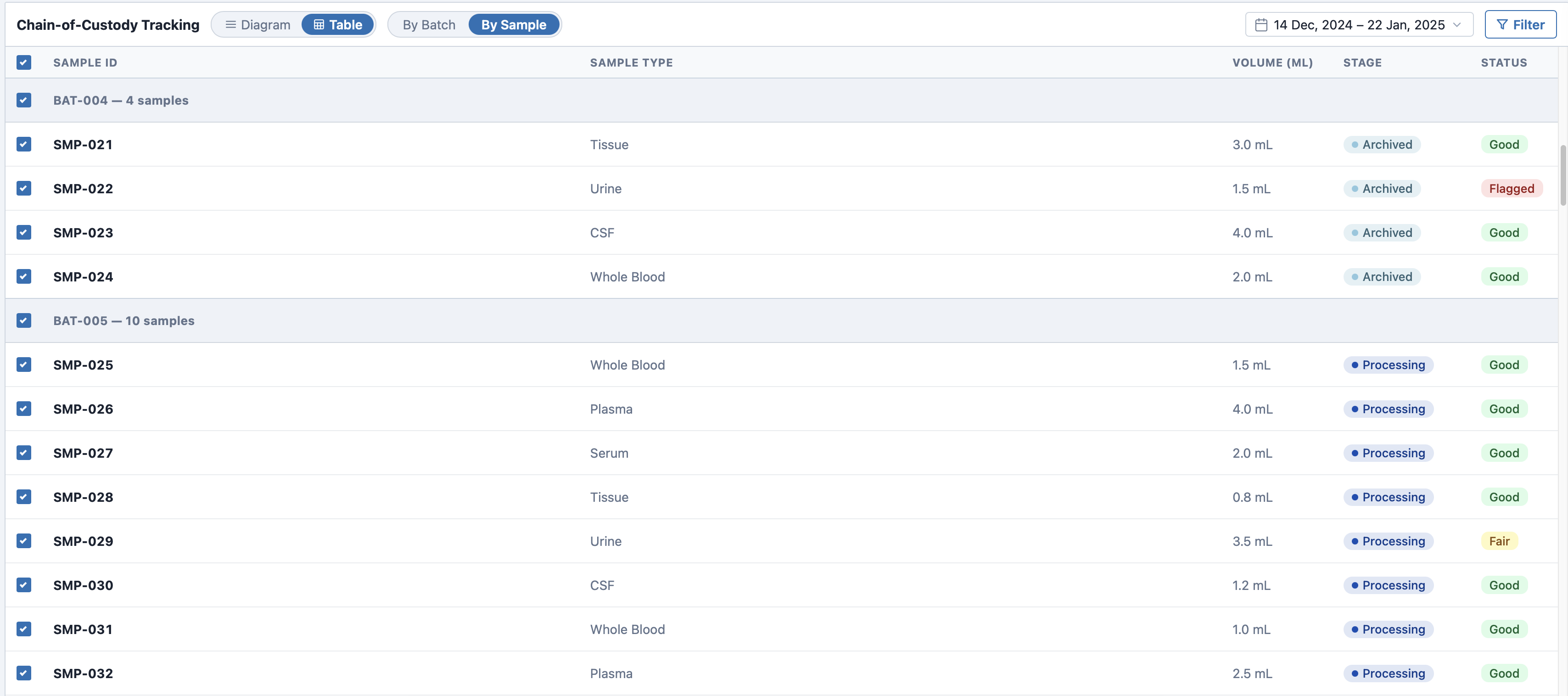
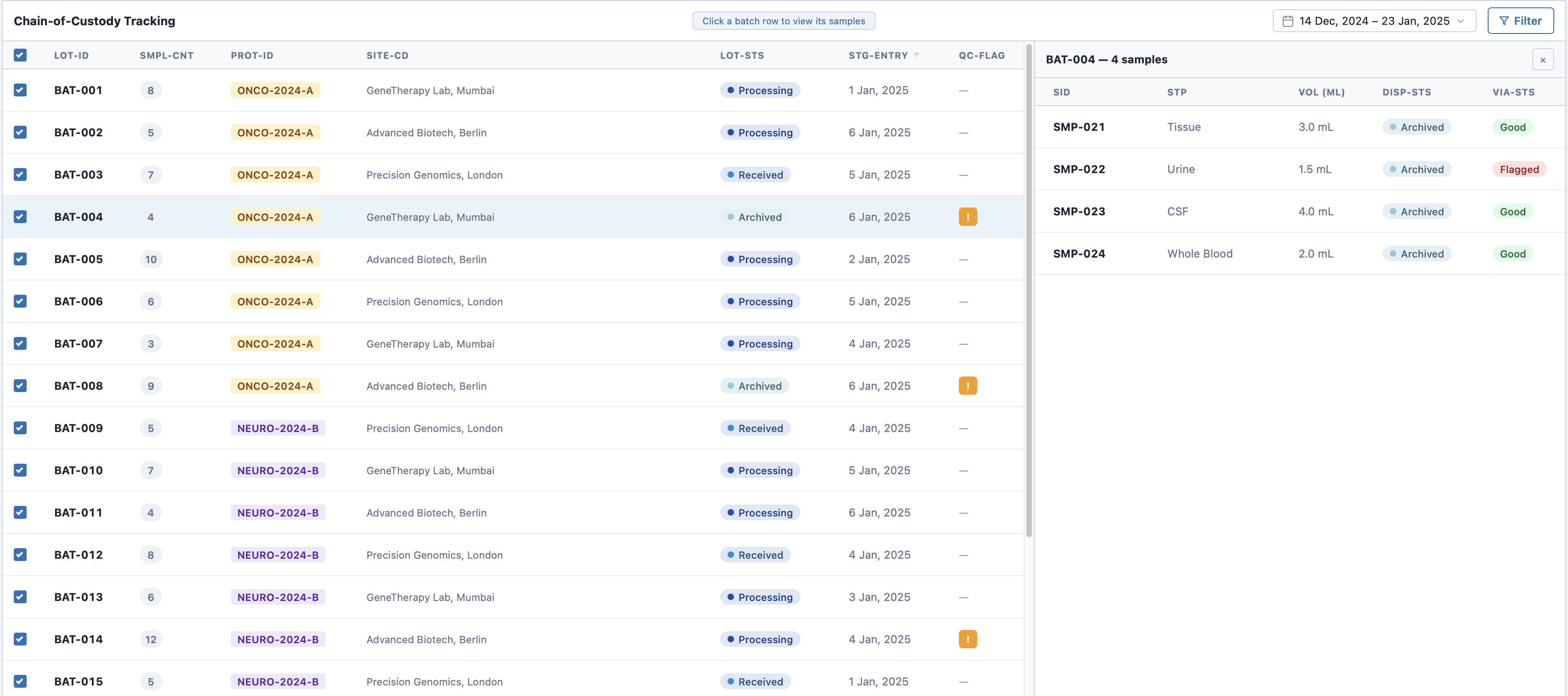
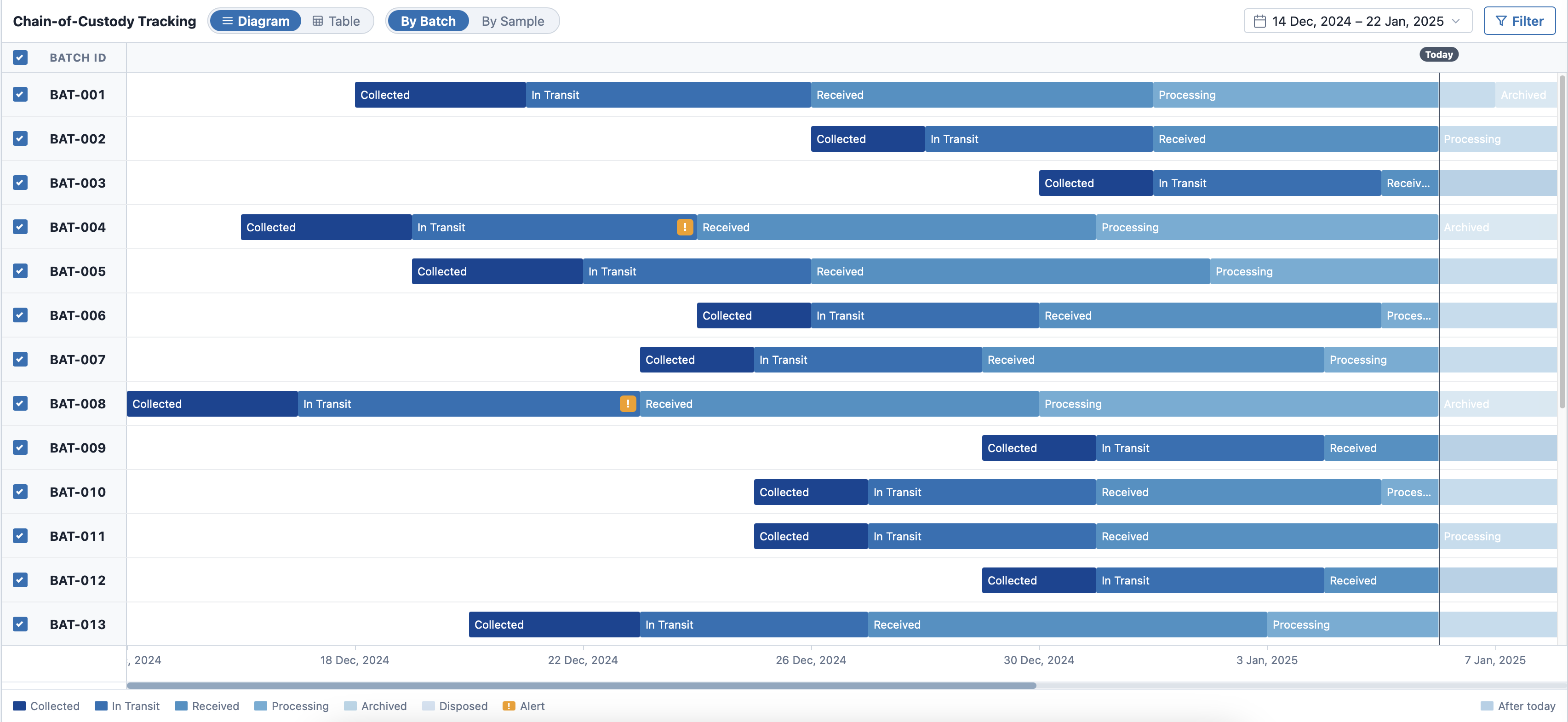
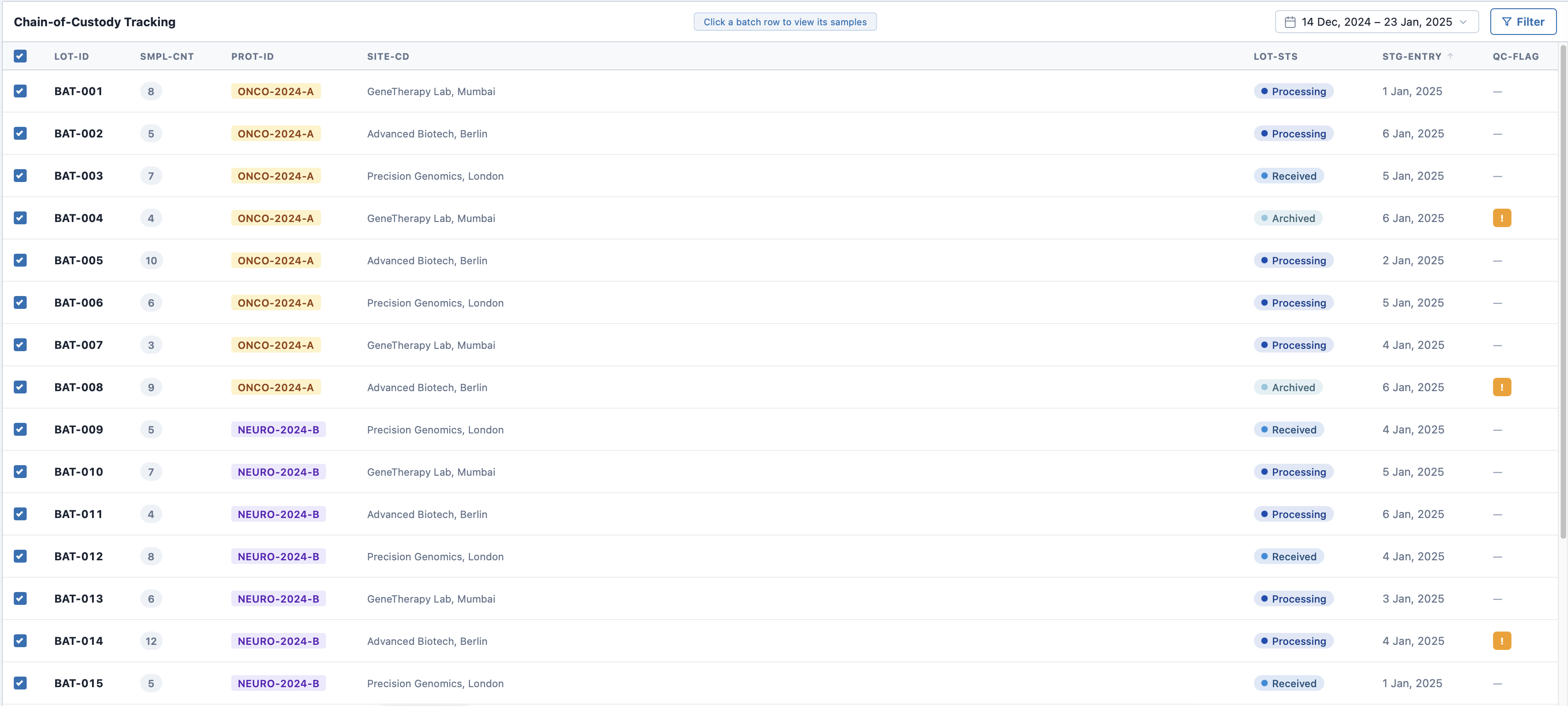
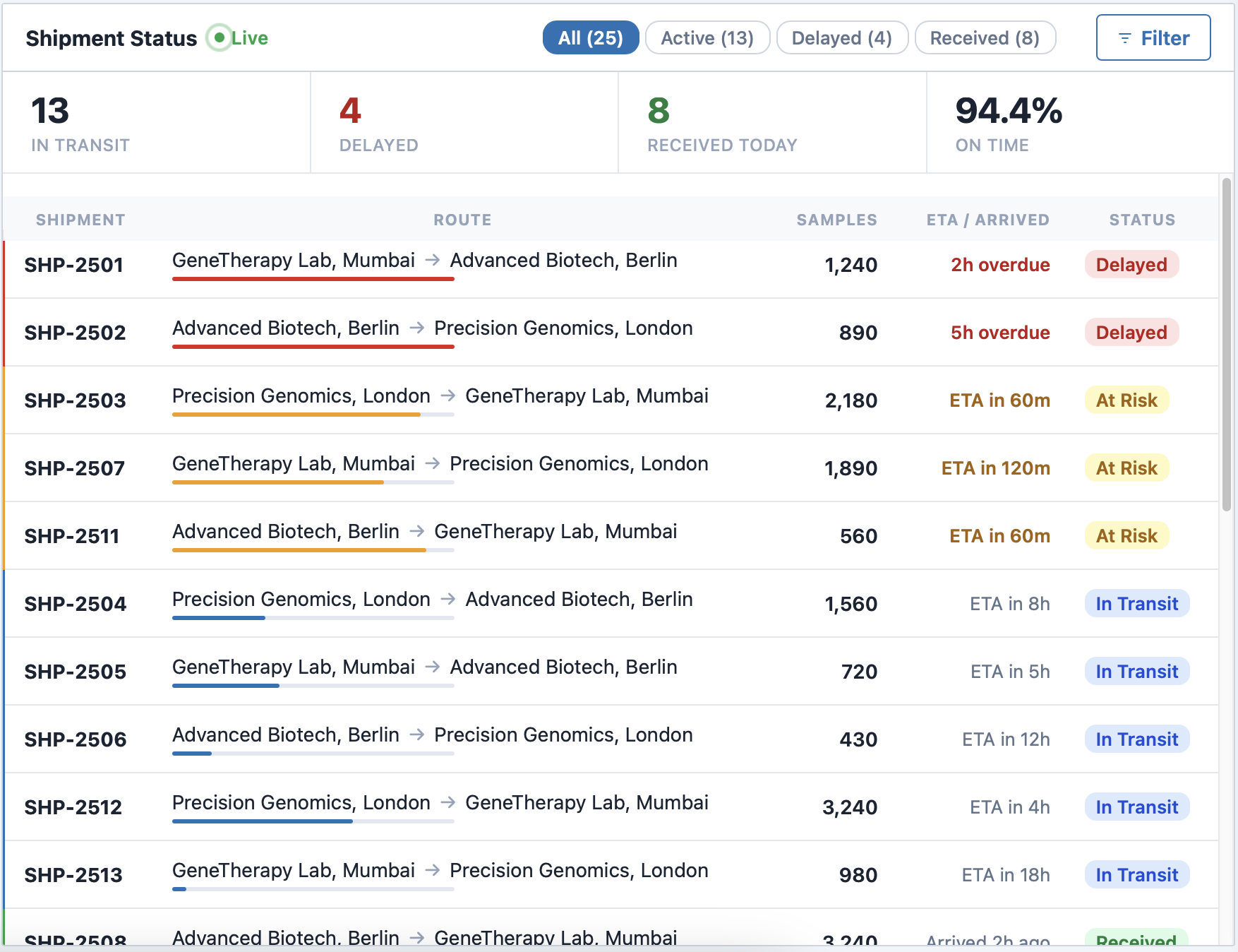
Every sample, fully traceable from collection to disposal
Find any sample in seconds, trace its full journey, and answer audit questions with confidence — without leaving a single screen.
- Batch-level table with lot status, protocol, site, entry date, and QC flags
- Side panel reveals a batch's samples without leaving the main table
- Report card with per-sample history from collection to disposal
Problems surfaced early, not after the fact
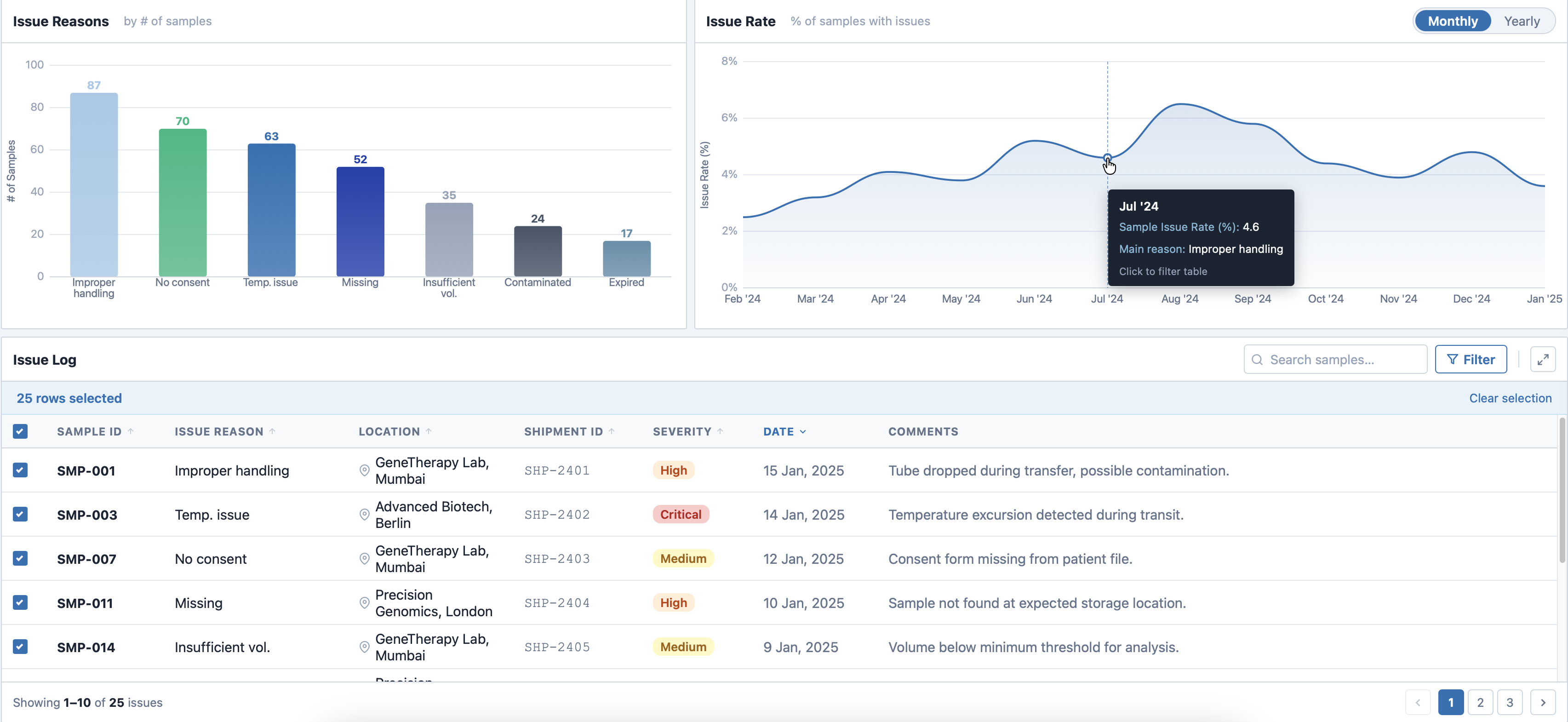
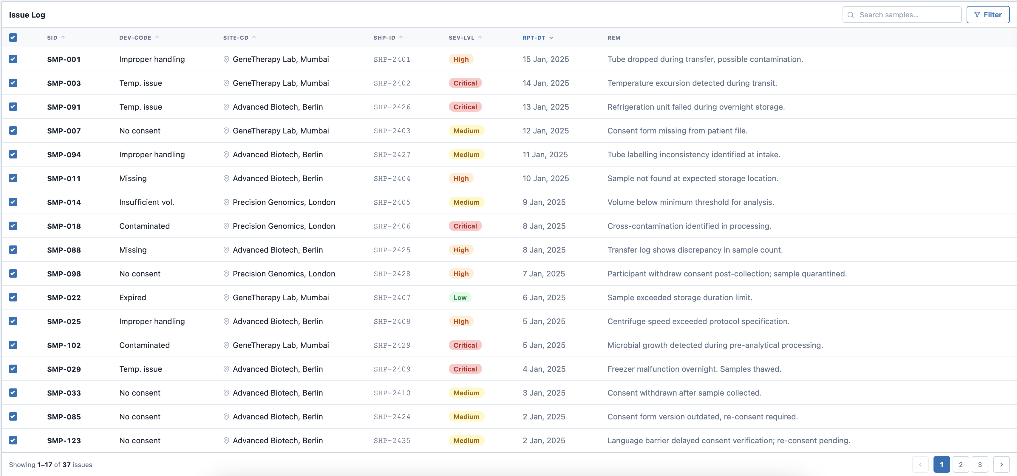
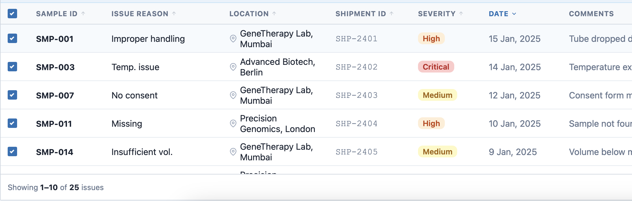
The issues board aggregated discrepancies and anomalies from across the system. Instead of waiting for lab reports, teams could see what needed attention — ordered by urgency, linked to the source record. For the full history of any sample, users drilled into a report card with its complete custody timeline, deviation reports, and investigation records.
- Filterable by issue type, severity, and study
- Status workflow from open to resolved
- Linked directly to the affected sample record
- Deviation reports covering root cause, impact assessment, corrective actions, and evidence photos
The first round showed where the design still broke down
At a certain point, design reviews were no longer enough. I ran usability sessions with current and potential users to stress-test the system in realistic contexts — gathering first impressions and finding pain points before investing further in the wrong ideas. Because this was the first round, I tested almost the entire product rather than narrowing to one flow.
 Before
After
Before
After
Two-part tracking view felt unintuitive
Changed: Consolidated the split table into a single unified view with a consistent interaction model throughout.
 Before
After
Before
After
Users wanted a more visual chain of custody
Changed: Added a visual timeline component alongside the table to make key handoff moments legible at a glance.
 Before
After
Before
After
Issues table wasn't enough for quick conclusions
Changed: Added summary graphs at the top to enable a quick overview of issue rates and types.
 Before
After
Before
After
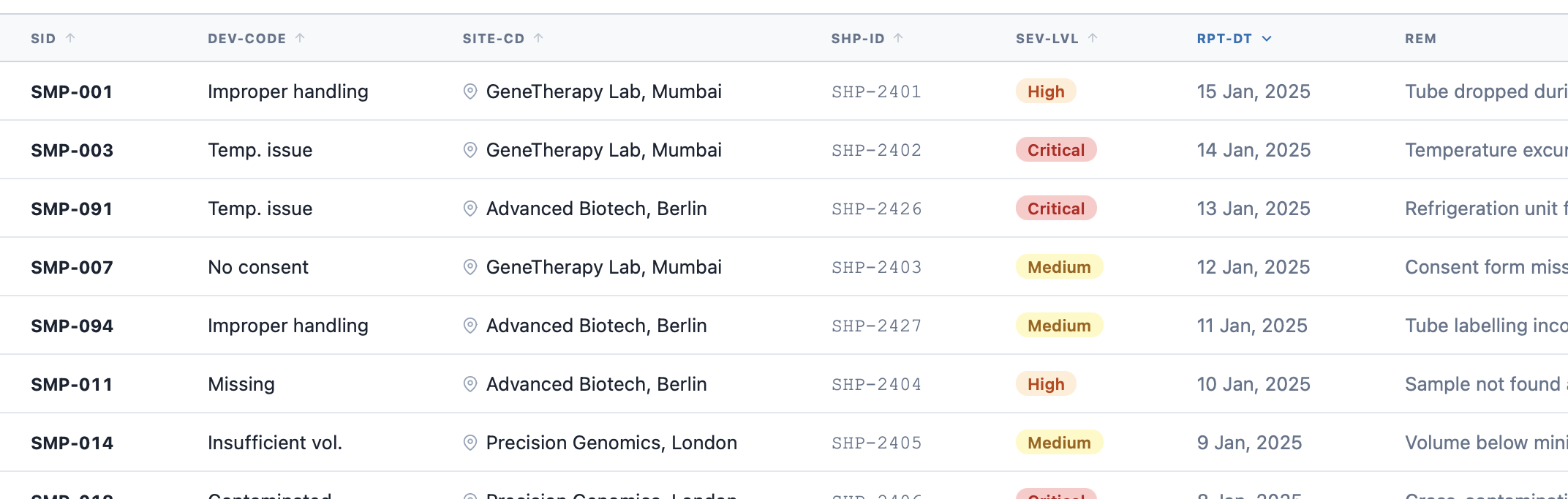
Technical labels were hard to understand for many people
Changed: Simplified header terminology across the entire system, to make it instantly clear while reading the tables.
 Before
After
Before
After
The map didn't match real operational needs
Changed: Replaced the geographic map with a live shipment board focused on urgency and bottlenecks.
The key pivot
Users cared less about geography and more about urgency — what was delayed, what was moving, where the bottlenecks were. That became the case for replacing the map with a live shipment board.
The product improved traceability, speed, and operational confidence
Sample Nexus moved the workflow toward a more centralized, automated system. The biggest gains came from reducing manual effort and making sample tracking reliable enough to trust in a regulated environment.
Reduction in sample loss through real-time custody tracking
Annual lab cost savings, by eliminating relabeling charges
Outcomes
- Faster, more confident decisions through better operational visibility
- More consistent data quality through automated tracking
- Better support for compliance and study protocol adherence
Nominated for Tableau's "Most Intuitive Interface" Award
An internal nomination recognizing the clarity and usability of the overall system experience.
Earlier validation and sharper requirement checks would have saved time
The strongest lessons weren't about visual design. They were about what happens upstream — missing information, unchallenged assumptions, and decisions made before the brief was fully clear.
Confirm data availability before design begins
Decisions were made on incomplete data assumptions. Waiting for confirmation earlier — even informally — would have prevented redesigns that turned out to be unnecessary.
Ask "why" before accepting a feature request
Some lower-value ideas stayed alive too long because the reasoning behind them was never questioned. A sharper intake process — even one direct question — would have filtered these out earlier.
More frequent early check-ins with stakeholders
Misalignment surfaced late because early reviews were too infrequent. Short, structured syncs in the first few weeks would have caught directional drift before it became costly to fix.