Improving Discoverability in a Data Model Repository
Designing a better repository experience for technical as well as non-technical users in the Model Match web application.
A Shared Source of Truth for Data Models
Model Match is an internal platform for shared data models and standards used across the organization. It brings trusted structures into one place so teams can find, compare, and reuse them more easily, while also giving the business better visibility into how standards are used.
To comply with my non-disclosure agreement, I have omitted and obfuscated confidential information in this case study. All information in this case study is my own.
Valuable data models existed — but were difficult to find, understand, and reuse
Model Match contained a growing library of shared data models, but the experience made them hard to discover, compare, and trust. Users had to navigate unclear flows, and interpret overly technical language just to identify the right model.
For less technical users, the platform felt especially fragmented and difficult to use, limiting adoption and slowing collaboration.
User Problems
- Unclear navigation Finding the right model required trial and error
- Overly technical language Non-technical users struggled to understand content
- Information overload Dense tables made scanning and comparison difficult
- Fragmented experience Moving between pages felt like using different tools
Business Problems
- Inefficient resource usage Teams recreated models instead of reusing existing ones
- Slow collaboration Misalignment and confusion delayed cross-team work
- Limited visibility No clear overview of model usage or adoption
- Slower delivery Product and data initiatives were delayed without quick access to standards
The Goal
Redesign Model Match to make data models easier to find, understand, and reuse across different user groups.
Serving four distinct user groups across the organization
Model Match was not built for one type of user. It had to support people working at very different levels of the organization – from specialists maintaining data standards, to managers choosing what to adopt, to executives looking for a high-level view of usage and impact.
I led the redesign
in a small remote team
This was a fast-paced 3-week remote project delivered by a small cross-functional team for a global pharmaceutical client. I owned the design work independently across UX/UI, research, and content, while collaborating closely with the Project Manager, Product Owner, Full-stack Developer, and client-side stakeholders representing key user groups.
My responsibilities
- Ran a UX audit and benchmark analysis before the redesign to surface existing problems and possible solutions
- Led the design work end to end
- Turned requirements into interface concepts and interactive prototypes
- Helped define what to prioritize within a tight delivery window
A 3-week timeline forced sharp prioritization
This was a fixed 3-week project, so the redesign had to stay focused on the parts most likely to improve clarity, usability, and adoption. I had freedom to rethink the product structure and suggest new functionality, but the work also had to stay realistic enough for implementation to begin soon after approval.
Key constraints
- No time for new interviews or usability testing
- Had to work within the client’s existing design system
- Some solutions were approved for later rollout rather than immediate build
How I responded
- Used existing research and product materials to move quickly
- Ran a heuristic audit to ground decisions in usability principles
- Prioritized the highest-impact flows first
- Separated what should be built now from what could wait later
Shipped in this redesign
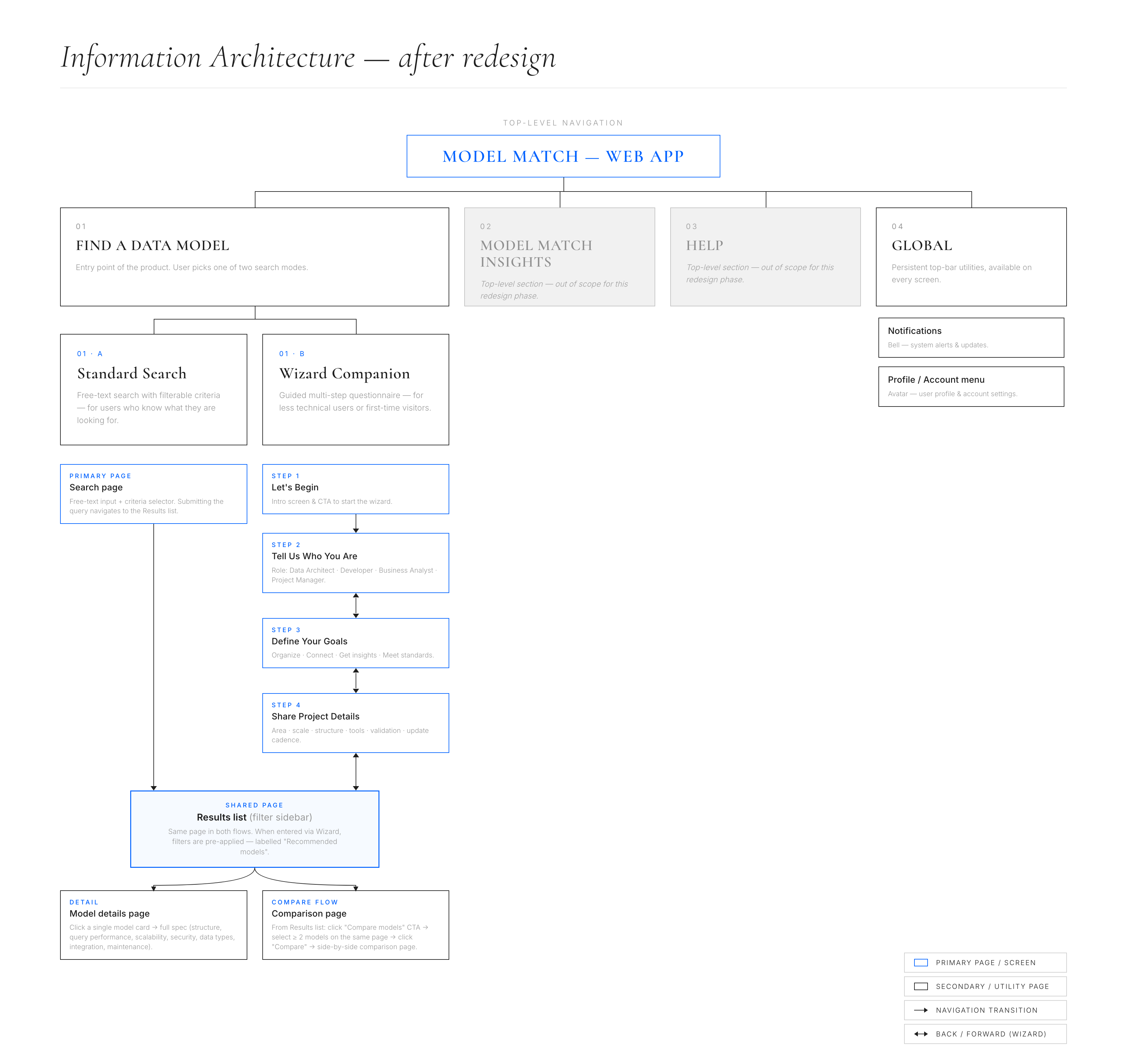
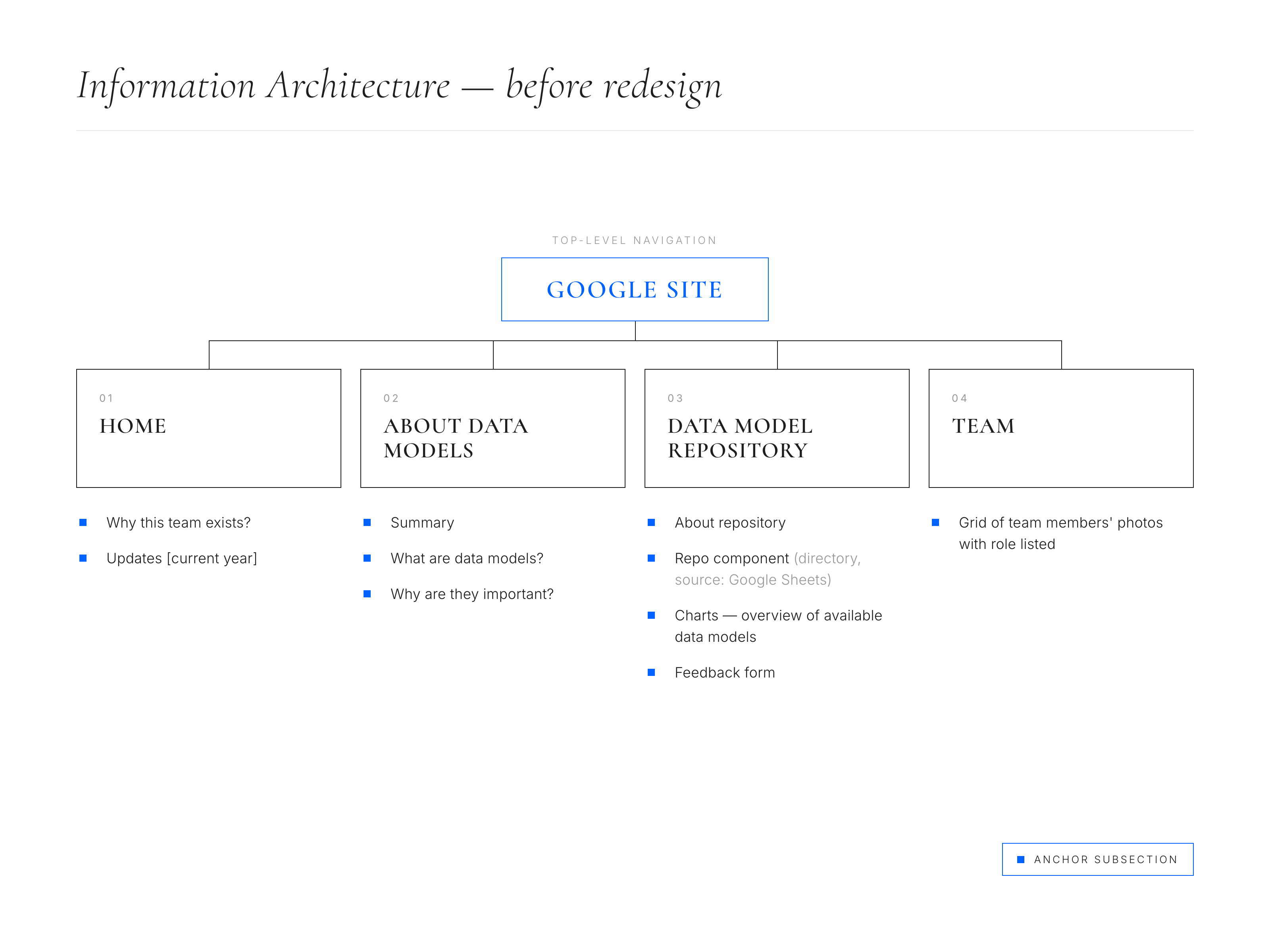
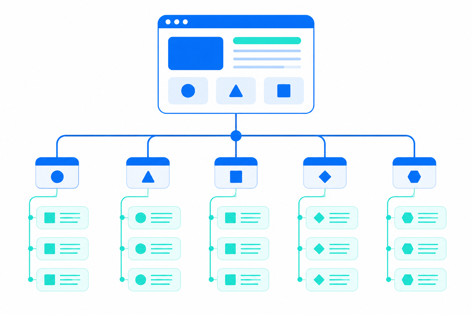 Restructured information architecture for the model repository
 Redesigned discoverability flows: search, filters and metadata
 Wizard guided search for non-tech users from zero
 Comparison table for data models
Parked for a future rollout
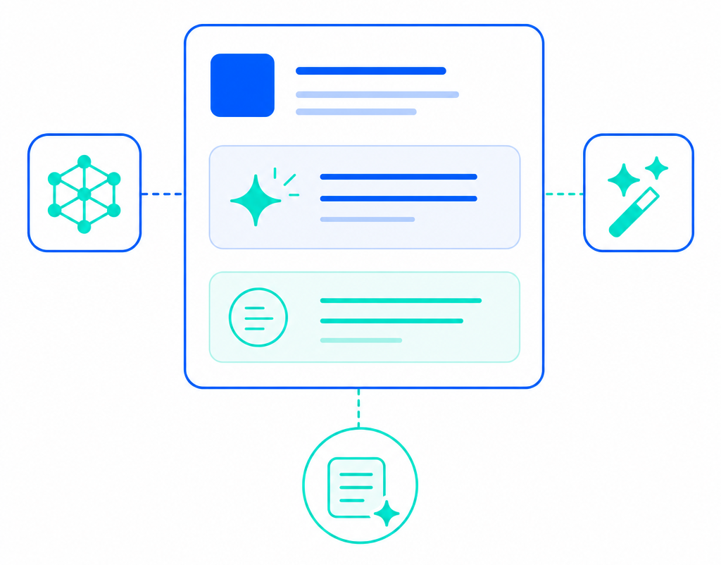 AI-based features for smart suggestions and summarization
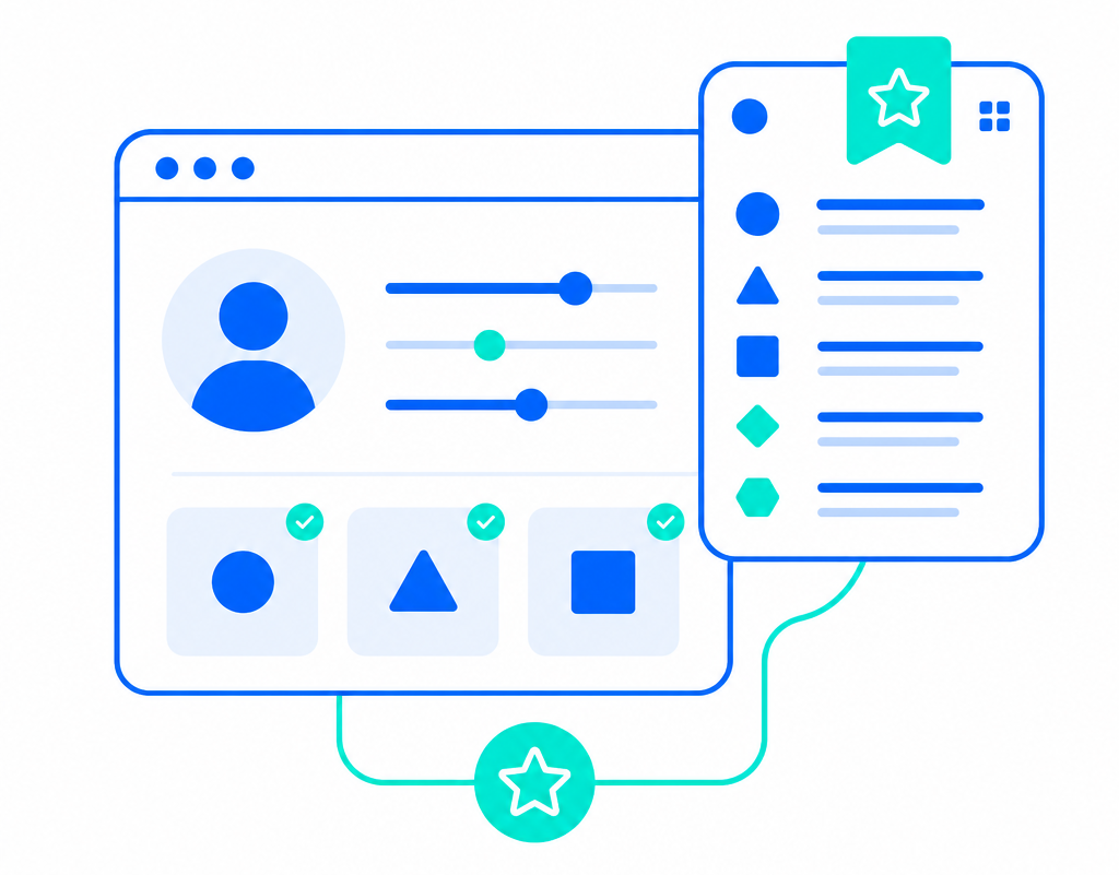 Personalization and saved view features
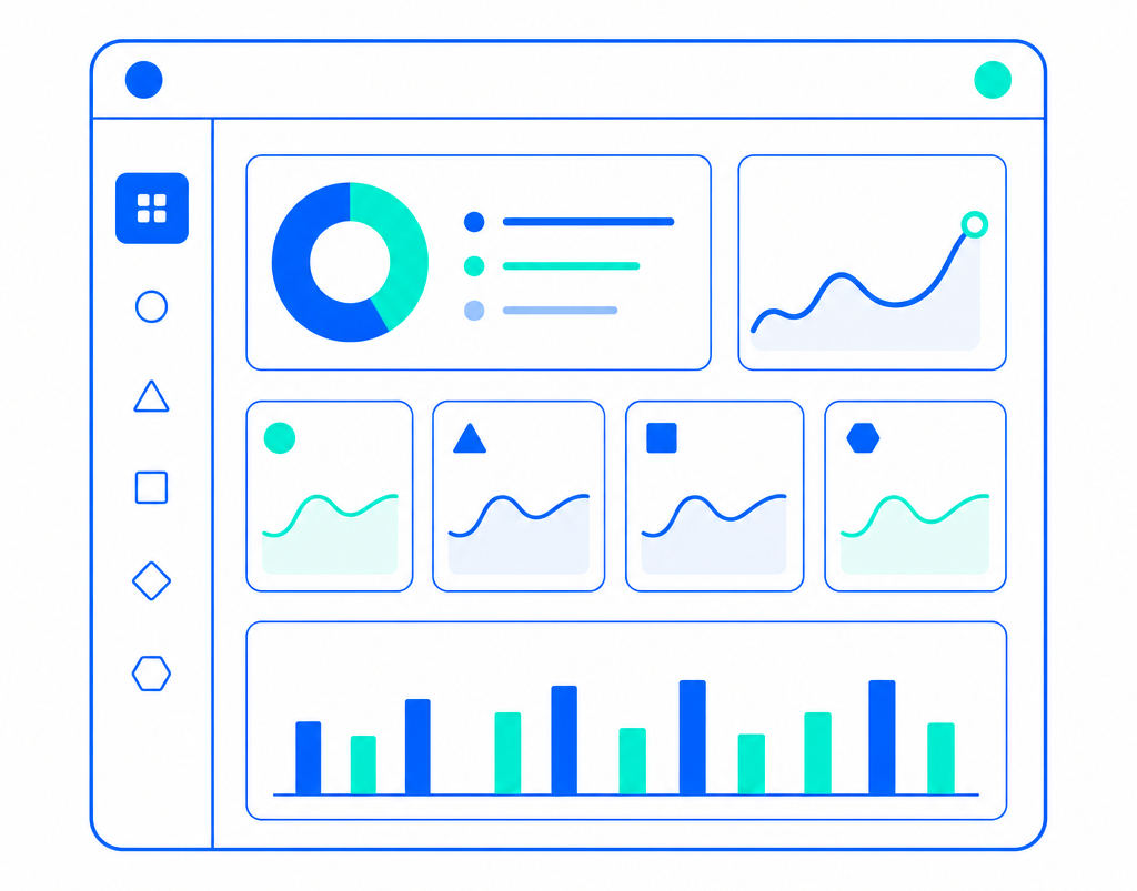 High-level overview dashboard showing adoption, usage and impact
How I turned existing evidence into a clearer, more usable repository
To shape the redesign direction, I combined secondary research, benchmarking, and UX audit to identify the most critical usability gaps. This helped establish clearer priorities for navigation, structure, guidance, and model discovery.
Existing research showed the problem was bigger than UI polish
I started by reviewing usability testing notes from earlier sessions run before I joined the project. This was the fastest reliable way to understand what users were struggling with, since there was no time for fresh research.
The strongest patterns were confusion around navigation, hard-to-scan tables, overly technical terminology, and difficulty judging whether a model was truly reusable. Positive signals such as filters, column controls, and model owner visibility were worth preserving.
Patterns that kept surfacing
- 01 Confusing app navigation
- 02 Difficult-to-read tables
- 03 Too technical language
- 04 Difficult to assess if model is reusable
A heuristic audit showed that the experience felt technical, cluttered, and inconsistent
To turn scattered issues into a clearer design direction, I ran a UX/UI audit of the existing prototype using Nielsen's usability heuristics. Four themes stood out: the interface relied too heavily on technical language, the content felt cluttered, the pages lacked consistency, and new users were not getting enough guidance. This helped me move from isolated usability issues to a clearer design strategy.
Mapping the existing app against Nielsen's usability heuristics
Themes that emerged
Language felt code-like and overly technical
Contact details exposed as raw structured data, dense developer-facing copy, and headers that did not greet the reader in everyday language.
Content felt cluttered and hard to scan
Tables surfaced everything at once, statistics competed with results, and secondary controls sat too close to the primary search.
New users were left without enough guidance
Search offered no example keywords, intro copy assumed prior knowledge of who the tool was for, and there were few cues for first-time exploration.
Pages did not feel like one product
Detail pages used a different visual language than the landing view, breaking the sense of moving through a single, coherent system.
Key action items
Benchmarking helped me design clearer comparison and guided discovery patterns
I used benchmarking to study how other products handled model comparison and guided flows, especially around comparison and wizard-style patterns. I was looking for ways to reduce confusion, make search feel more guided, and help less technical users move through the system with more confidence. The strongest patterns were not the most complex ones. They were the ones that reduced decision friction and made the next step obvious.
Guide users to the right match with clearer search suggestions
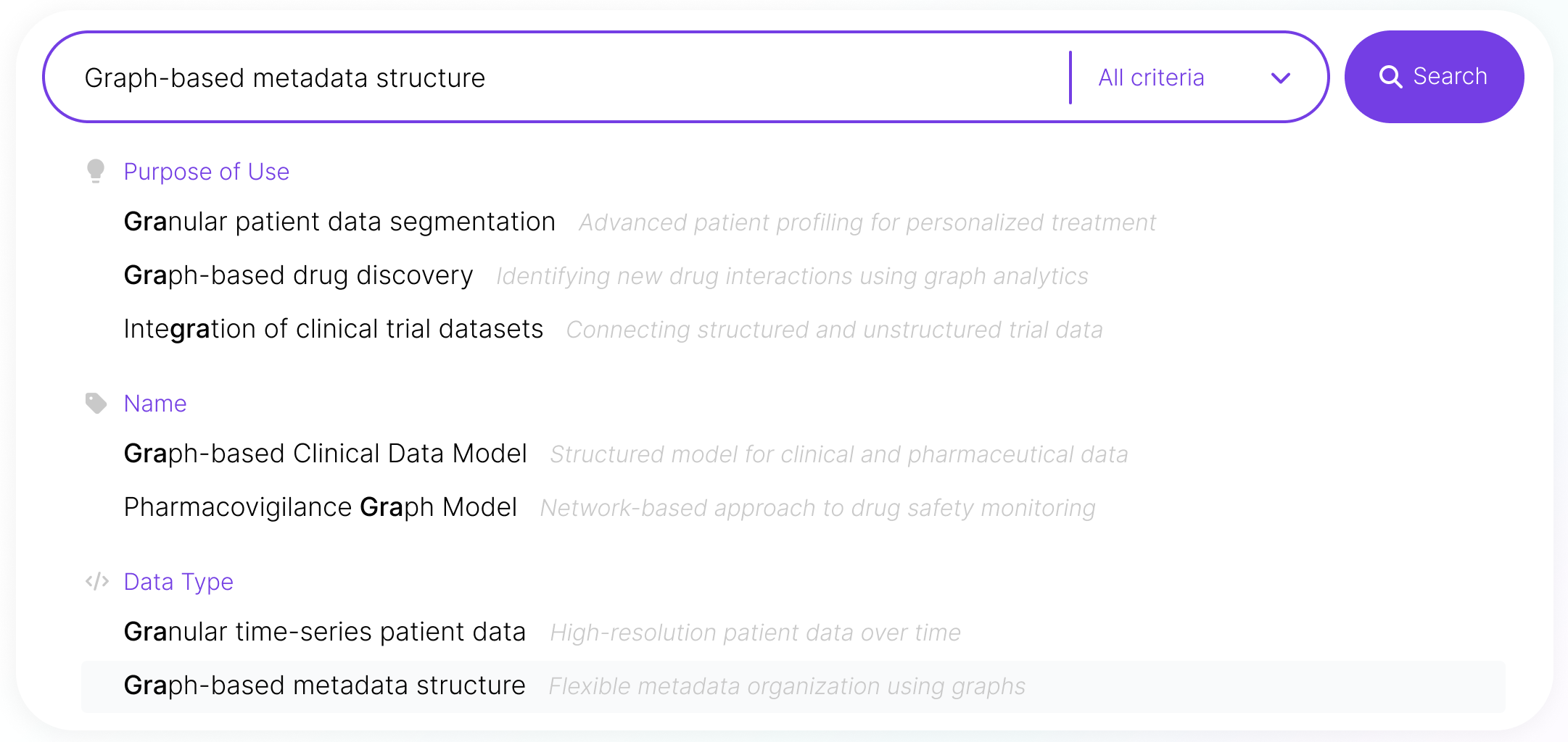
The strongest combobox patterns did more than match characters – they framed each result so users could understand it instantly. Grouping by category, leading entries with icons, pairing technical names with plain-language descriptions, and highlighting both the typed fragment and the currently selected entry turned search from pattern-matching into informed selection.
Lead less technical users with named steps and clearly explained options
The clearest guided flows shared a few habits. They committed the full screen to one task at a time, used a compact stepper to name and number every step, presented options as illustrated tiles, and described each choice in plain language. Together, these patterns turned the wizard into a transparent path rather than a mystery — users could see how many steps remained, what each option meant, and where the next click would take them. For a less technical audience, that visibility is exactly what makes the system feel safe and trustworthy.
Comparison tables share a familiar structure across products
Across the comparison tables I studied, the underlying grid was almost universal: entities ran across the columns, their properties down the rows, and content stayed short and skimmable. The strongest examples treated this grid as a quiet foundation — soft separators, mixed cell content, and subtle differentiation between entities guided the eye without ever shouting. Comparison feels effortless when the structure is predictable.
How it influenced the design
Benchmarking gave me a clearer direction for the redesign, with each exploration pointing to one anchoring principle. The combobox study showed that the strongest search experiences frame every option so the user always knows what they are looking at. The guided-wizard study demonstrated that a step-by-step flow stops feeling endless when every step is named and the path forward is signposted at every turn. The comparison-table study revealed that predictable structure carries the meaning — once the grid is familiar, the content itself can do the talking. Those three principles directly shaped how I approached search, guided discovery, and side-by-side comparison in ModelMatch.
Key design takeaways
From the combobox study
Name the thing the user is looking at
Search turns into informed selection when every option carries category, icon, plain-language summary, and clear highlighting — so the system tells the user what they are picking, not just what matches the characters.
From the wizard study
Make the path feel short and visible
A guided flow stops feeling endless when every step is named, illustrated, and reinforced by a CTA that spells out exactly where the user is heading next.
From the comparison-table study
Let structure carry the meaning
Comparison feels effortless when columns hold entities, rows hold properties, and the grid is so familiar it disappears — leaving the eye free for the content itself.
Taken together, the prior usability-testing notes, the heuristic UX audit against Nielsen's principles, and the three benchmarking studies pointed to the same conclusion from three different angles.
The system needed a serious rework — clearer structure, plainer language, a sense of cohesion and some kind of guided search to help less tech-savvy users.
That became the foundation the next phase of design was built on.
Improving Models Discoverability Through Better System Structure
The original experience made even simple tasks feel unnecessarily difficult. Navigation was full of surprises, terminology was difficult to grasp for less technical users, and moving between pages felt disconnected. The redesign focused on creating a more coherent experience through clearer structure, simpler language, guided flows, and improved comparison patterns – helping users find and evaluate models with more confidence and less cognitive effort.
 Before
After
Before
After
Navigation felt full of surprises and disconnected
Changed: Restructured the information architecture into clearer groupings with simpler naming and more coherent flows between pages.
Design Decisions Benefits
Friendlier navigation
Clearer naming
Better grouping of information
New guided path for less tech-savvy users
Improving the Experience One Workflow at a Time
The redesign aimed to make ModelMatch look and feel more professional, while keeping it simple and intuitive. The new experience made it easier to search and compare models. It offered clearer structure, better guidance, and more consistent interactions. This helped users find what they needed more quickly and with less effort. Working closely with stakeholders and the developer helped keep the solution in line with user needs and technical feasibility.
Demystifying Search & Discovery
The original search experience made it hard for users to find relevant data models. It was slow and cognitively challenging, especially for less technical stakeholders. I redesigned the workflow to make search more intuitive, scannable, and easier to navigate by improving the visual hierarchy of results and introducing clearer guidance throughout the experience.
 Before
After
Before
After
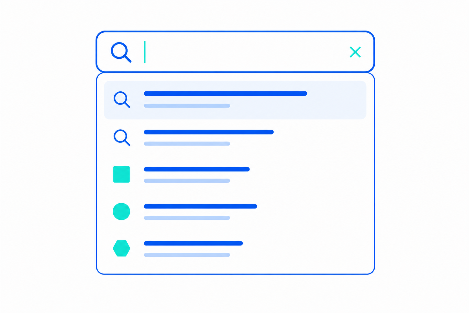
Search was slow and users felt lost
Changed: Added autosuggestions with category division and short descriptions.
 Before
After
Before
After
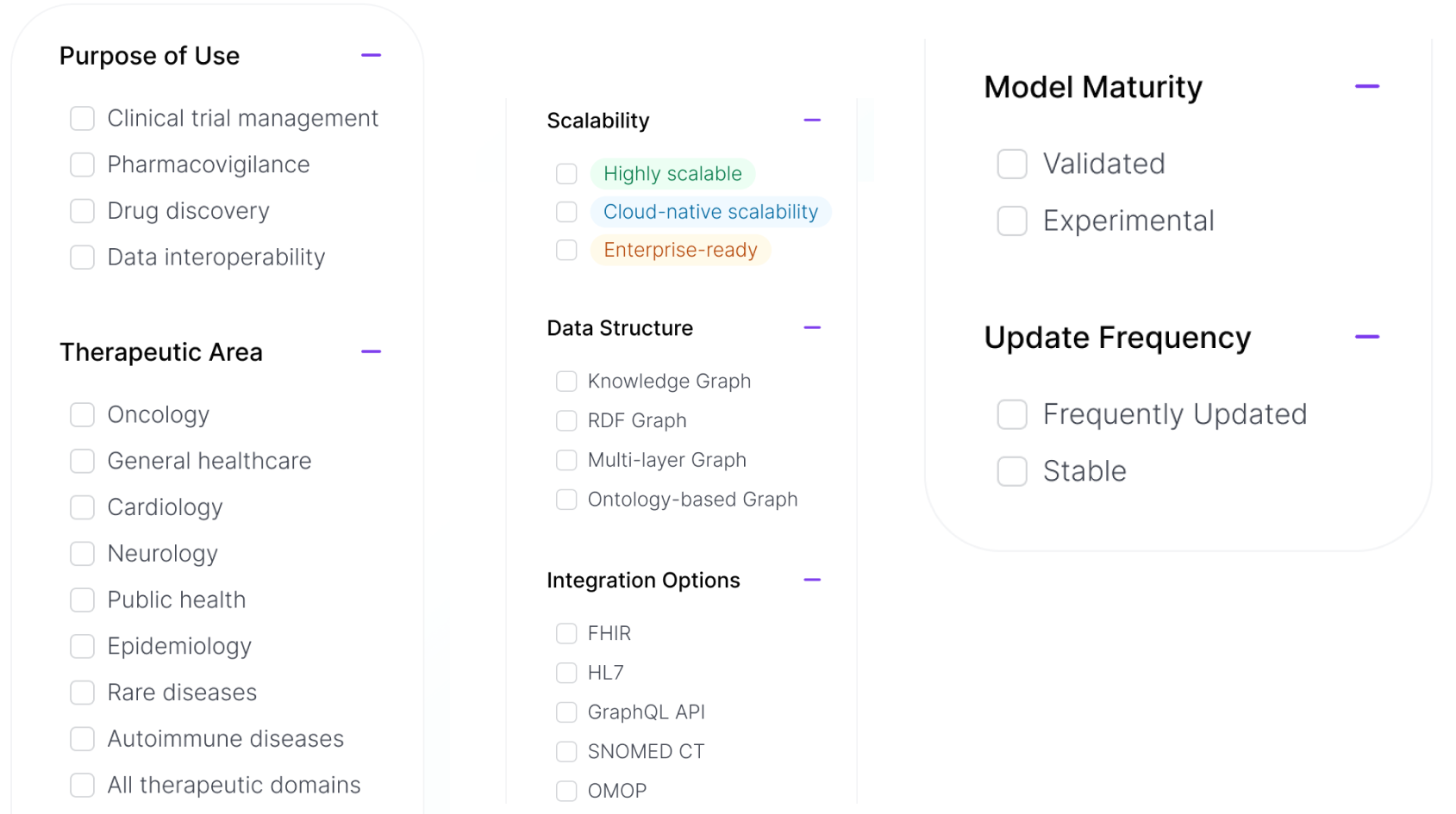
Filters were poorly visible and scarce
Changed: Added more relevant filters, placed them in the side panel and made values visible by default to enable easier comprehension.
Key Improvements
- Added autosuggestions after three characters to speed up search.
- Grouped suggestions based on type and added descriptions for better clarity.
- Moved filters to a familiar left-side panel.
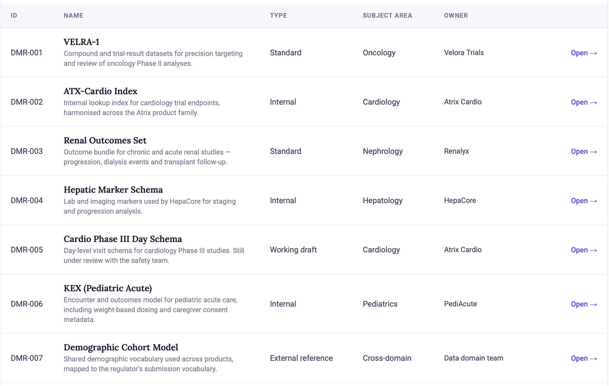
- Introduced rich-in-detail result cards for faster scanning and more informed choices.
 Before
After
Before
After
Results were difficult to identify
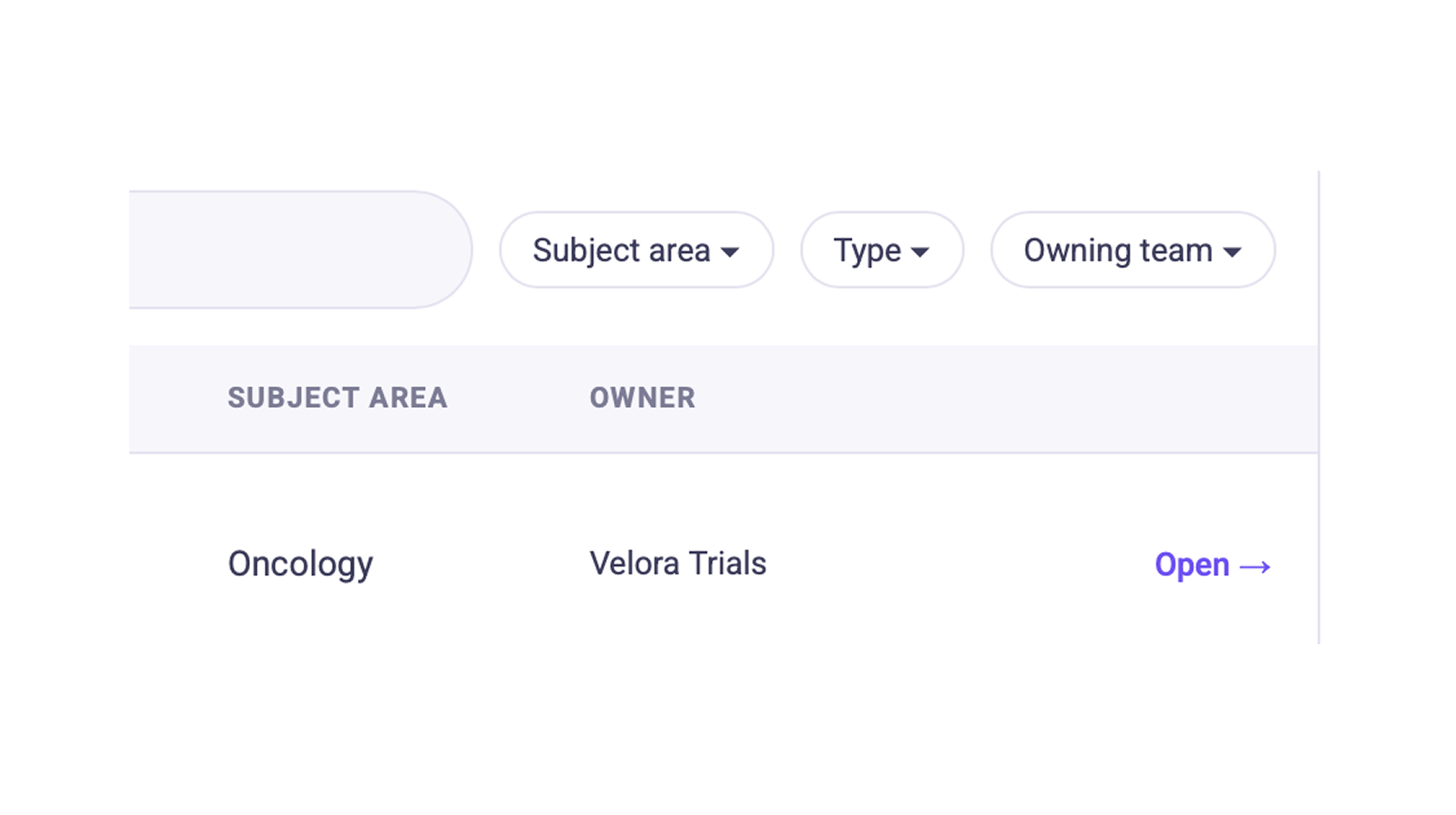
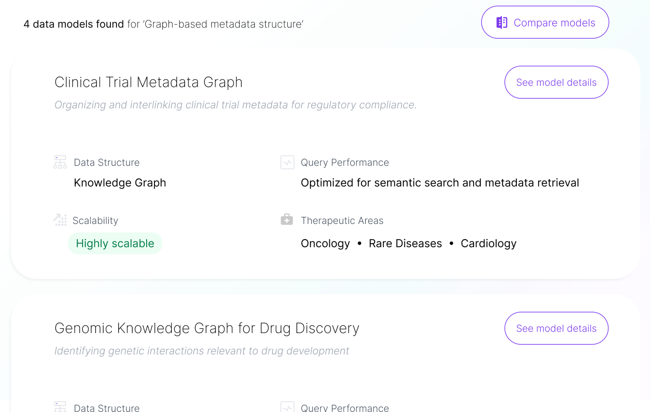
Changed: Redesigned the results page with rich, structured cards that surface key model attributes at a glance for faster, more informed decisions.
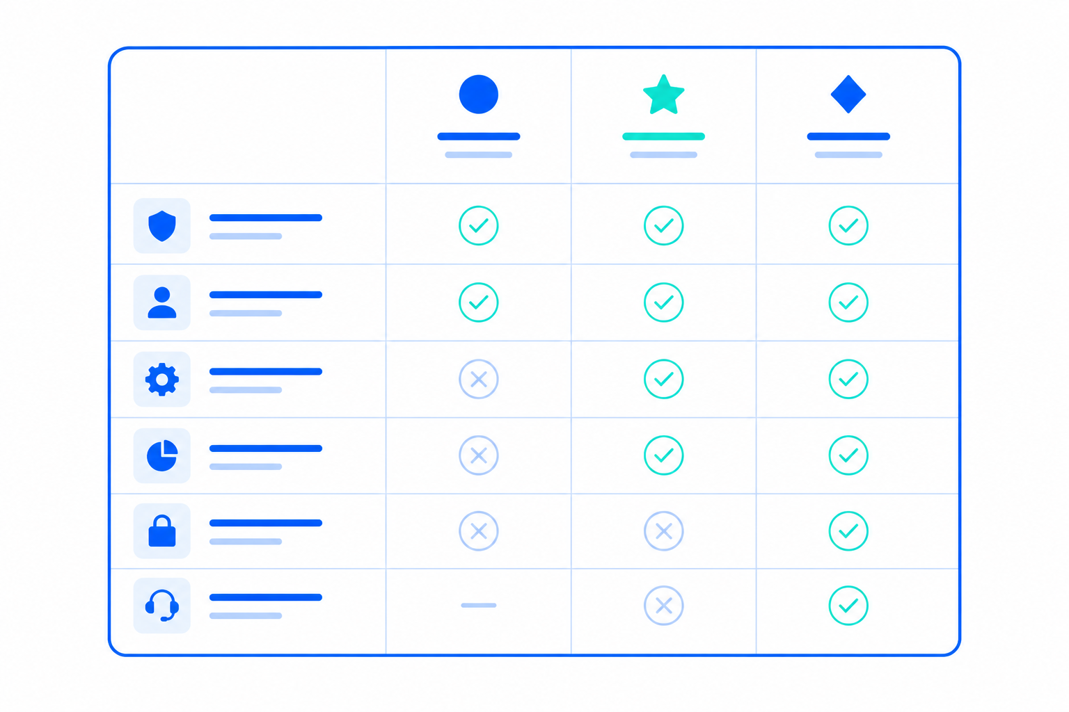
Enabling a dedicated comparison experience
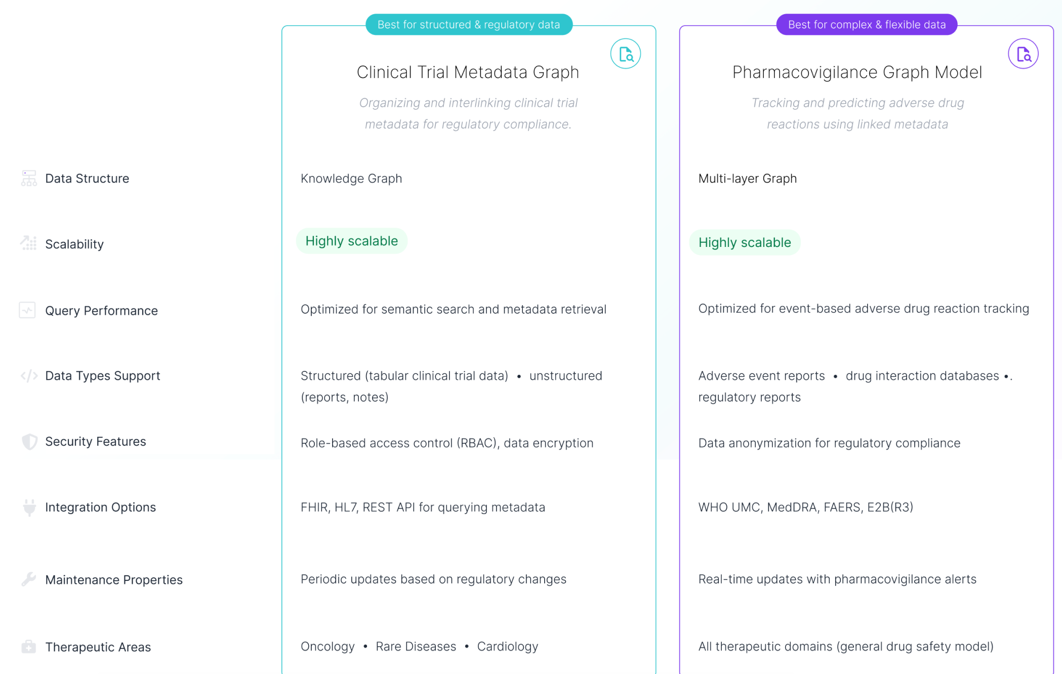
Comparing models in the previous ModelMatch version was nearly impossible. On the basis of information in the table about each model, the decision was very hard to make. Due to the redesign, users can now select at least two relevant models in the main interface and compare them in a convenient way – using the classic comparison table.
Key Improvements
- Added a dedicated, prominent CTA that clearly names the functionality
- Guided model selection with short instructional cues at the bottom of the screen
- Introduced a dedicated comparison table module for easier evaluation of key attributes
 Before
After
Before
After
Comparing models was nearly impossible
Changed: Added a classic comparison table on a separate page. This well-known format lets users easily compare two or more data models by looking at their key attributes side by side.
More data available about each model
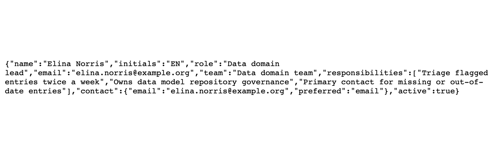
So far, the data about each model in ModelMatch were very limited. One of the aspects of the redesign was to make more data available to users, which would allow them to make more informed decisions. It was crucial to create one central location in the system that would gather all detailed information about a single model. It would cover technical capabilities, integrations, therapeutic areas, and contact details.
Key Improvements
- Added a single common space containing all details about a specific data model, enabling more informed decisions
- Provided an easy and straightforward way to contact the person responsible for a given model in case of any questions or errors

 Before
After
Before
After
Contact details were too technical and unclear
Changed: Only relevant contact details were made available in the data model details page. With a single click, users can now contact an expert in case they have any questions.
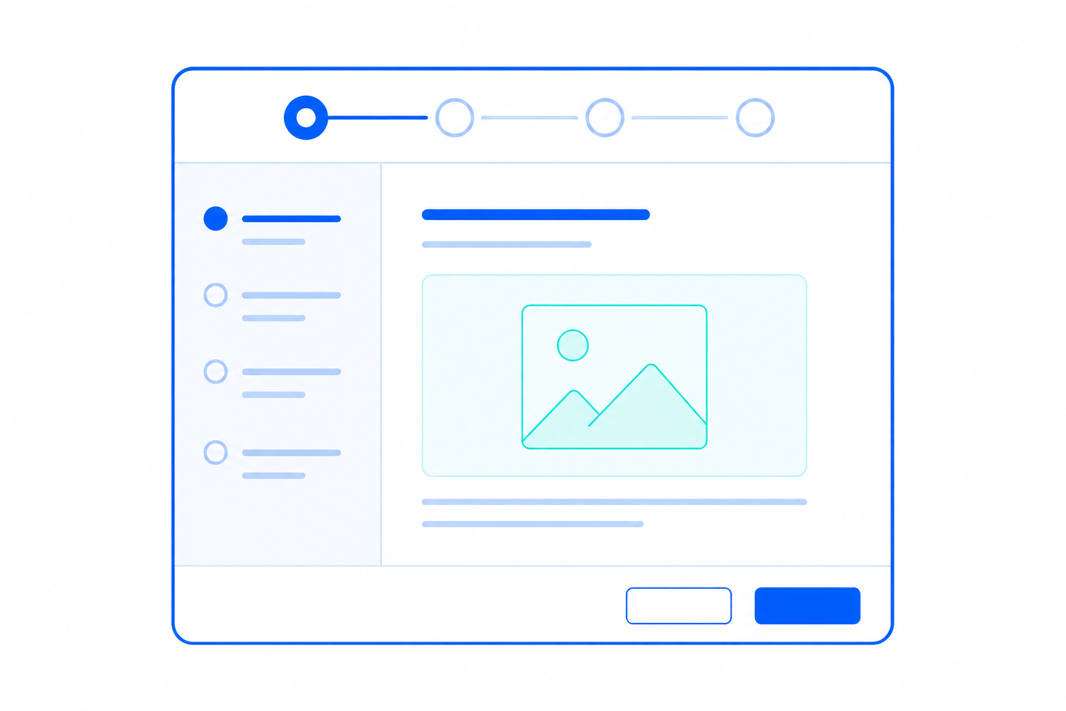
Introducing a new friendly way of model discovery
One of the main issues revealed during the research was unintuitive language on top of a very complicated domain. Therefore, I needed to introduce tools for less tech-savvy users to help them explore data models with ease and confidence. That's why I came up with the idea of a guided wizard companion – to increase a sense of safety for non-technical people in a technical world.
Note: This functionality was yet to be developed further by adding larger base of detailed questions and improving the underlying algorithms.
Key Functionalities
- Added a new module to guide users through a complex process of model exploration with ease
- Translated difficult domain language into a user-friendly, natural language that everyone can understand
- Provided a short explanation for each option to increase the sense of understanding even more
- Everything in the form of a step-by-step wizard buddy so there's no way to omit important aspects or get lost in the process
The redesign made discovery faster and the platform more coherent
The redesign achieved its main goal: it made Model Match easier to navigate, easier to understand, and easier to use across different roles. The strongest outcomes were faster model discovery, clearer access to information, stronger adoption across teams, and a more consistent experience that helped the platform feel like one reliable system rather than a set of disconnected pages. Other product teams also responded positively to the new structure and asked to reuse the UI as a template for their own solutions.
Reduced time-to-find key models
Higher adoption & satisfaction
Key Outcomes
- Faster model discovery
- Simpler and more consistent experience
- Clearer access to information
- Stronger adoption across teams
- Positive internal signal through reuse interest
We love what Model Match has become — can we use it as a blueprint for our own team's services?
Two Lessons That Would Strengthen the Outcome Further
This project successfully established a clearer and more usable direction for Model Match under a very tight timeline. Looking back, two things would have strengthened the outcome even further.
Aligning terminology across different user groups
Challenge
One of the recurring challenges was balancing technical accuracy with clarity for less technical users. Different audiences often understood the same concepts in varied ways. Some terms that seemed clear to experts caused confusion for newcomers.
Lesson for the future
In future projects, I will focus on validating domain-specific language with various user groups early on.
Reason
This will help pinpoint which terms should stay technical for accuracy and which need simplification or clearer explanations to boost usability and adoption.
Earlier conversations about timeline flexibility
Challenge
The three-week timeline helped keep the project focused, but it also meant some ideas had to remain validated directions instead of being fully implemented.
Lesson for the future
In future projects, I will connect earlier with the people responsible for delivery planning and timelines.
Reason
This way, I can see where we have flexibility and when expanding the scope could add more value for users and the business. With more time, the experience could have included better onboarding, AI smart suggestions, personalisation features, and a high-level insights dashboard that we postponed.